Journal.
Why icons are not very good for user experience
Icons are a common element in user interfaces, designed to provide a visual representation of a specific action or concept. While they can be useful for quickly conveying information, the use of icons can also have negative effects on user experience.
![]()
WordPress development vs. SaaS solutions: a comparison of CMS solutions
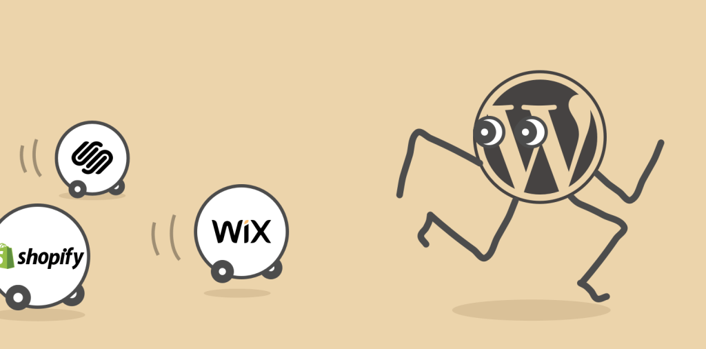
Friends sometimes like to warn us “Squarespace will eat your lunch”, but [spoiler] we don’t think so yet.
There are many ways to approach building a website with dynamic content. We planted our flag in the WordPress camp around 2012. We’ll take a look at the pros and cons, as well as contrast with the alternatives available from SaaS providers like Squarespace.
Typography: Design has more details than many would care to know
“Paul Watzlawick’s first axiom of communication—“one cannot not communicate”—puts it very succinctly. If you fail to consider the effect of your message on the recipient, you may inadvertently communicate that you do not care how your message may be received.”
-Erik Spiekermann in foreword to Practical Typography
Big news for web developers: Internet Explorer 11 is no longer supported on Google Search
It’s been a busy year and keeping up with updates has been… well, non-existent.
But a piece of news that dropped today inspired me to shout from this digital rooftop: Google has dropped support for IE11 in its core search experience.

The turtles get their fourth shell
It’s such a cliché when the chef heads home and eats instant noodles. The carpenter’s house is full of broken furniture. But so it was: that our nine-year-old website had gone fallow.
