Journal.
Why icons are not very good for user experience
Icons are a common element in user interfaces, designed to provide a visual representation of a specific action or concept. While they can be useful for quickly conveying information, the use of icons can also have negative effects on user experience.
![]()
Spike Jonze directed video for the Apple HomePod
There is so much craft to be inspired by in this new ad for the Apple Homepod. directed by Spike Jonze, featuring FKA Twigs, and a new track by Anderson .Paak. If only homes could be responsive too.
Take a look at the making-of video (6:48).
Smartphone sensors are about to get a whole lot smarter
There’s a new breed of sensor coming out – they measure the chemical composition of things using photon spectrometry, and these example applications from crowd-sourcing platforms show that there are countless amazing applications for these, in conjunction with smartphone apps.

This is the SCiO
User Reviews & Comments: A Battle Between Engagement & Trust
Let’s have a look at best design practices for integrating user reviews and comments into your website.
There are many online services that seek users’ opinions to help other visitors make decisions. Sometimes this is a simple quantitative rating, as seen on Rotten Tomatoes with their average audience scores, or on Open Rice here in Hong Kong. It could be as simple as the ‘thumbs up’ or ‘thumbs down’ on YouTube or the ‘like’ button on Facebook. Other times user prose is solicited in the form of comment, forum replies, or reviews. Sometimes the user opinion extends to the judgement of other people’s comments. Witness YouTube comments being hidden for having too many negative marks, or the ordering of answers on Yahoo Answers or Quora by ‘most upvoted’.
There is undoubtedly a value to user interaction. TripAdvisor is built on the concept, and a quick look at YouTube ‘likes’ is a great indicator of video quality or relevance. But cheating the system is often possible, and a discerning interweb-surfer will remember to proceed with caution and truckloads of salt.
How do we create trust in the user-generated content on our websites?
Good question.
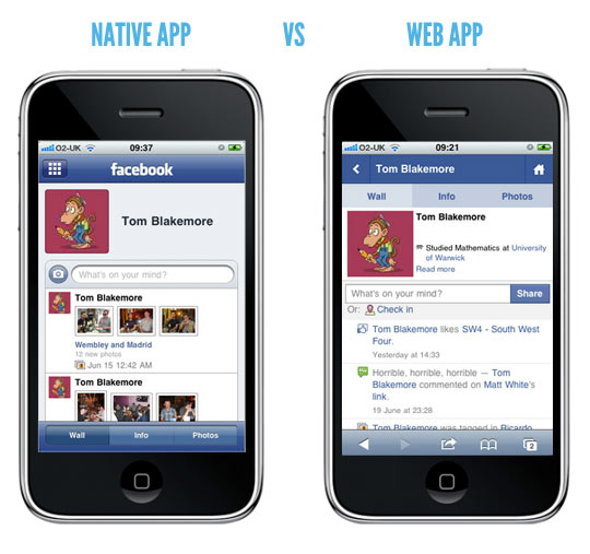
Native App vs. Web App; Why Hong Kong Mostly Gets It Wrong.
In Hong Kong, there are many examples where a popular website or business decides to release an app. In this sense, ‘app’ is short-hand for a native application; a downloadable thing that creates an icon on your homescreen, be it on an Apple mobile device (iPhone, iPad, and iTouch), or on an Android, BlackBerry, Nokia, or Windows device.
But there is another type of ‘app’. It’s called a web application, or web-app for short. In this context it usually refers to a website that, one way or another, works well on mobile devices. And it’s usually the better option.

Forgive me Hong Kong, but we are generally a little backward when it comes to this sort of thing. Let me reveal a little secret: most websites do not need a native app. Let me explain.
