Reflections On The Ubiquity Of Poor Design in Hong Kong
- Oct 2012
- Web Design
Hong Kong can be a cold hard place for the curious designer.
Every street corner reveals ill-conceived design choices, aesthetic horrors, and evidence of typographic neglect. It can be hard to keep your bearings. To grasp tightly one’s moral compass and keep fighting the good fight.
Annoying Designer Obsession?
Pity the designer’s cohorts, who must hear the cries and laments upon every opening of a menu, passing of a tram, or interfacing with, well, anything. There are the obvious culprits: the Comic Sans and Arials that reveal the true care for design (and designers) that the merchant has.

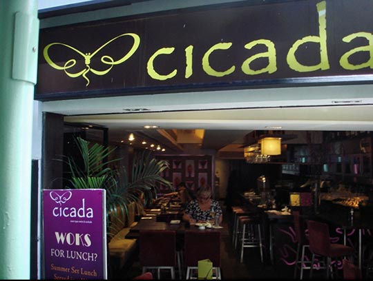
Enormous, Windows pre-installed font Papyrus as a logo in Soho is one thing; but pairing it with an Art Deco font for a rubbish pun followed by two further typefaces on the same board? I’d go next door, but it’s the same.
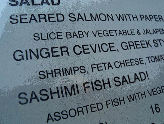
There are spelling errors that you would not expect when ordering a $400 Artic [sic] Char in a swanky hotel.

I might give this raw fish a wide berth if they can’t spell it right.
Website Design in Hong Kong
Then there are the websites. Oh! the websites!
PCCW‘s retro 80’s offering, and their infuriating steadfast refusal to support Chrome, the world’s most used browser.
HSBC asking customers to input the last 8 digits of the recipients account number, when account numbers are in 3-6-3 format. Could this be any more fiddly? How about every second digit divided by two and rounded up to the nearest integer? And all on a time limit before you time-out and are returned to the login screen.
MTR corporation couldn’t make it harder to get a map up on your phone. How many clicks to get to a non-Flash version of a map on their site? You try.
The question that troubles me is: how can I argue that good design is important in the face of thriving businesses that just don’t care? Most people don’t consciously care about typeface choices. People find workarounds or simply tolerate poor user experience.
One fruitful avenue is to point at the monopolies that are represented above. It’s impossible to vote with your wallet when there are no alternatives. See how in the UK where competition is greater thanks to OFCOM, BT has a beautiful and well-considered website design. But this doesn’t explain why high-end restaurants can get away with shoddy interiors and graphic design in a competitive market. Perhaps the food makes up for it, but I have to believe that people have been conditioned here to expect poor design. It is a shame, and it is reflective of a culture that is giving a little less thought to the bigger picture than is healthy. The API is a sobering indication of this.
Of course, in some circumstances you do not expect a full branding exercise. The local laundry service can probably get by on a simple home made logo. Designers need to be mindful of this. Not all projects require high design, but all would benefit from our honest and diligent effort to make it the best it can be.
I find guidance in the words of Frank Chimero in ‘The Shape of Design’:
Design also finds itself in the middle of art and commerce. The practice’s hybrid quality breeds different opportunities than either practice can alone, allowing for a special sort of influence on culture. Design can speak the tongue of art with the force of commerce. The products of design maneuver in the streets of the city where people live, rather than the halls of a museum where they must be visitors. There needn’t be the pressure of artistic credibility or commercial profitability always present, which means that the work of the designer can go further in shaping culture than a traditional piece of art, and make money in a way that has more soul and spill-over benefits than straight commerce.
Design’s connective role is meant to support the movement of value from one place to another for a full exchange. It means that the products of design are not autonomous objects, but are creations that bridge in-between spaces to provide a way toward an intended outcome. The design must be transformative for it to be successful. It must take us somewhere. Airports and train stations are other examples of non-autonomous creations that exist as in-between spaces, because they have been built out of our desire to go somewhere else. Even cathedrals could be considered spaces of transit, because they seek to connect the physical world with the spiritual realm. Design is akin to these places in that their usefulness is defined by the consequences of the connections they facilitate. A train station that doesn’t create a lust for exploration is flawed, just as a cathedral that doesn’t inspire awe is a failure.
