Studying User Onboarding can inform all UX design
- Oct 2017
- Web Design

User onboarding design is a really important, but often neglected, part of creating any web or mobile application. It’s your first impression; a getting-to-know-each-other exercise. One wrong step and your product or service could be in the trash before the fickle user has even given it a go.

Samuel Hulick is a UX designer laser-focussed on this part of product development. On useronboard.com he publishes ‘teardowns’ of popular apps in great detail. He also sells an e-book ‘The Elements of User Onboarding’ as a guide to improving user adoption. It’s an enlightening read.

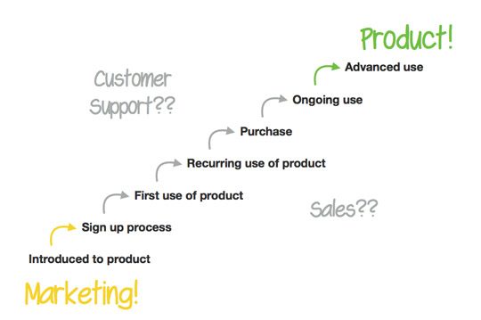
A screengrab from the book, showing how easily the onboarding process is neglected in organisations.
A look at Samuel’s detailed and light-hearted teardowns will convince anyone how many things there are to consider.
Most design literature focusses on concepts like typography, whitespace, colour theory, hierarchy, and best-practices. All well and good. These walk-throughs give an amazing insight to other aspects that need more love from designers.
Things like intention, psychology, priming, focus, attention, voice and tone. Taking a zoomed-out look at the whole process, rather than individual steps. Using labels and signposts to guide and encourage users. Going beyond the static visuals to respecting the user’s context, state-of-mind, cognitive load.
A lot of this is equally important across all of interaction design. We think all stakeholders in developing websites, apps, and products would benefit from spending time looking through Mr. Hulick’s unique lens.
