Chinese and Other Non-Latin Typefaces for the Web – Google Noto to the Rescue
- Jul 2015
- Web Design
If you’re designing for multiple-language web interfaces, you’ll want to consider Google’s beautiful Noto typeface as a great starting point for non-English views.

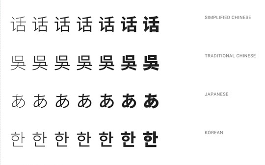
Google’s Noto typeface was designed specifically to support all scripts in the Unicode standard. It is a huge ongoing project that was released into the wild in 2013 to help with font support and consistency on their Android phones.
You can read about the rationale and learn more about it from Google’s own Material Design specifications.
While Google are using this in their mobile device interfaces, we can also use them to our benefit when designing and developing for screens, or even for print.

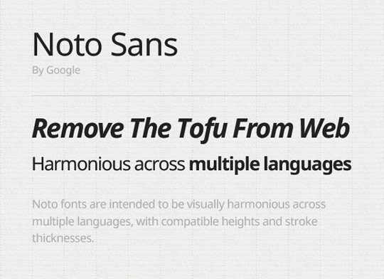
“Tofu” is the nickname given to the squares that sometimes replace broken characters.
Noto looks really nice in all the scripts I’ve seen. And there are so many weights! This is pretty rare in most Chinese fonts I’ve seen. Because Noto is released under the Apache License, it can be used for free on websites, apps, basically anywhere. Furthermore it can be downloaded to your machine for use in any artwork or comps. This is great, since a lot of paid fonts require you purchase them before you send a design to a client for approval. A process I’ve never understood.
Another great thing about using this is that on Android phones, the user will already have the font installed, meaning quicker loads.
Alongside Noto you can also consider Droid and Open Sans which have similar libraries of scripts. If you need an easy fallback, or are designing for heavy-use applications and performance is an important factor consider using such a font.
