Why does Web Design in Asia Seem so Backwards?
- Feb 2014
- Branding
- Web Design
Some thoughts on web design in Asia. Randomwire wrote a piece back in November that I’ve just stumbled upon, exploring the technological, linguistic, and cultural reasons behind why Japanese websites appear old fashioned and hopelessly cluttered. It is excellent and thought-provoking.

Speaking as a Western educated designer, when reviewing local Hong Kong and Chinese web design I have often been struck by the yawning difference – in design and code – when compared to sites in the US or Europe.
Edit 29Apr2014: Some Prime Hong Kong Web Design Examples
Some of these are just old and for one reason or another the organisation has not seen fit to update. Others, well, just defy justification.
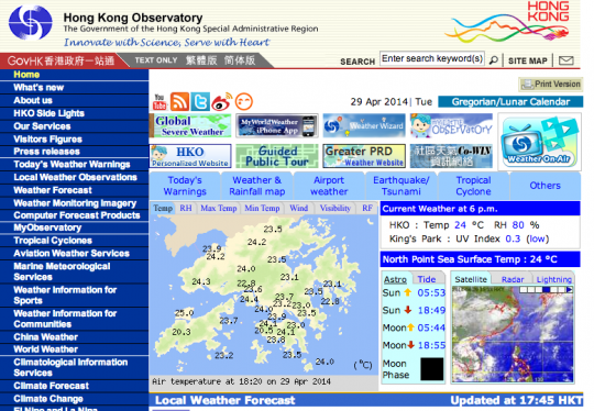
The Hong Kong Observatory. Run by the government and visited no doubt many billions of times a year. Their native apps are not much better. See if you can count how many layers of menu and link banners there are before you get to any information about the weather. Let’s hope there aren’t ever any weather-related emergencies! …note the copyright notice at the foot is © 2003.
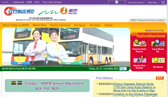
New World First Bus. A corporate site that looks like it may have been built by the same designer. Retro combos of gradients, text glows, and rounded corners. A testament to the bus oligopoly and their aptitude for customer service. Good of them to share the humidity levels and date though. © 2011
Yahoo Hong Kong. Hard to say much here as Yahoo assume that all people in Hong Kong only read Traditional Chinese, and offer no translation.
No excuses for Hong Kong
Hong Kong can’t use the excuse that we were so far ahead of the curve that we had already built a popular infrastructure around flip-phones and WAP, as Japan had. But I would add to Randomwire’s list that Hong Kong high school students are not really nurtured to explore creativity and play as are their Western counterparts. So in addition to Randomwire’s observation that the Japanese are prone to copying existing trends, in Hong Kong we have an additional challenge of there being only a small pool of creative talent that might push the envelope.
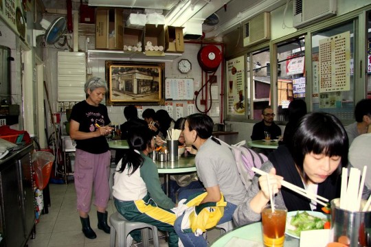
Further, I think there is a can-do attitude to Chinese business that focusses strongly on the immediate bottom-line, at the expense of care for design and aesthetics. Witness the local cha chaan teng. Cheap, fast and delicious food. But with plastic stools and fold-up tables, dirty walls with ancient layers of beer ad posters, calendars from years gone by. These things may lend themselves to a unique character – and how I crave Hong Kong lunch offerings when overseas for any length of time – but they stand testament to the disregard for aesthetics, or any effort to look good.

Of course there are beautifully designed things in Hong Kong, just as there are some pretty cool websites. We just hope to see more of it.


